
In the early 1980s, the computer industry was suffering from a severe case of the uglies.
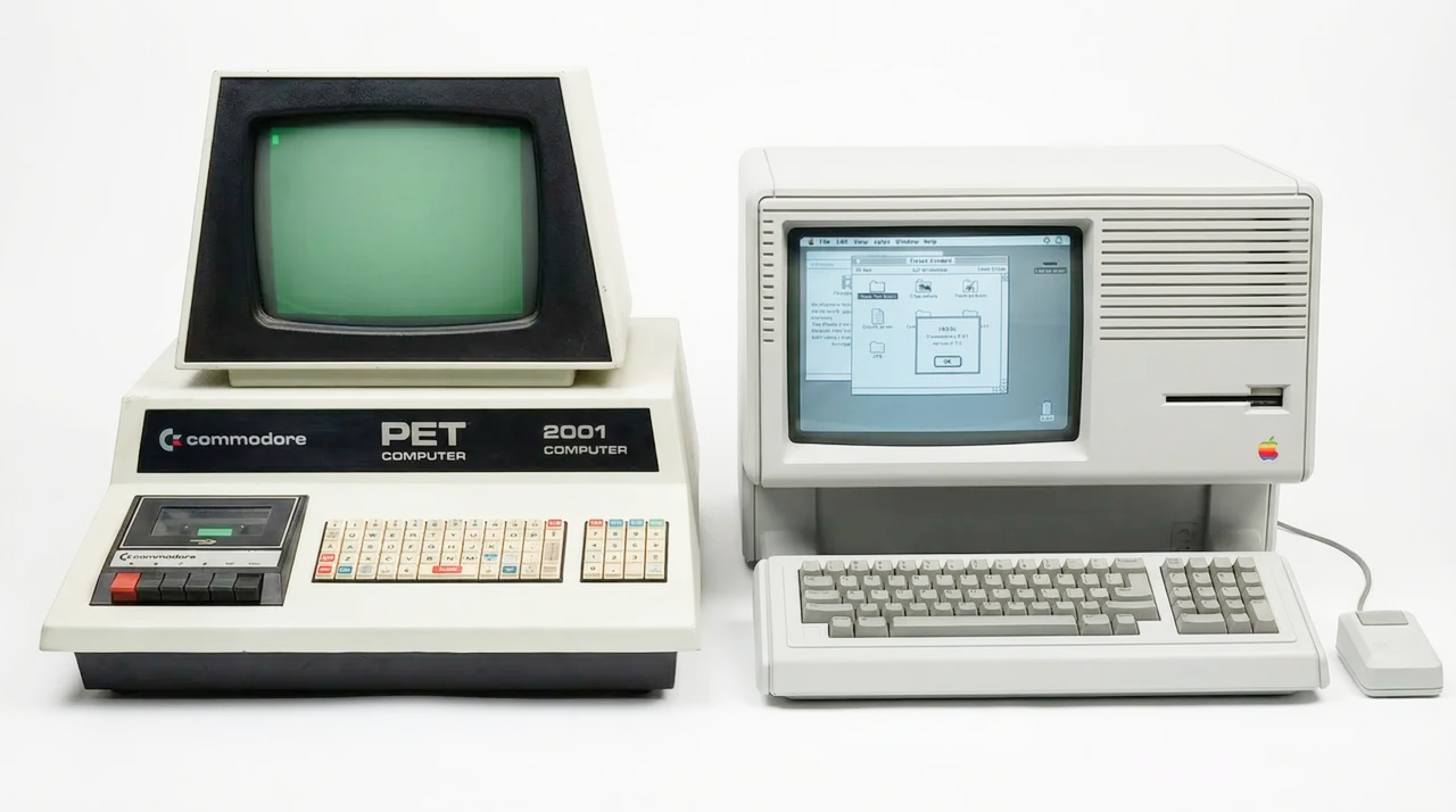
Walk into any office, and you were assaulted by "corporate beige." Computers were massive, intimidating monoliths of cheap plastic and sheet metal. They were designed by engineers who viewed aesthetics as a frivolous waste of money. Their mandate was simple: Build the machine, then find a box to put it in.
Steve Jobs hated this. He famously said, "We’re going to make high-tech products where it’s immediately obvious what they are... Simplicity is the ultimate sophistication."
He didn't just want a better-looking computer. He wanted a Design Language — a visual code so strong that you could cover the logo and still know exactly who made it.
This is the story of Project Snow White, the moment Apple decided that beauty was a business strategy.
1. The Million-Dollar Napkin
To fix Apple’s fragmented identity, Jobs did something unheard of. He launched a global contest.
In 1982, Apple invited the world's best design firms to audition. The winner was a German agency called frogdesign, led by the eccentric and brilliant Hartmut Esslinger.

Esslinger was expensive. His contract was for $1.2 million a year — an astronomical sum for a design consultant in 1982. But he offered something Jobs couldn't buy elsewhere: a philosophy.
Esslinger’s first rule was non-negotiable: Design dictates Engineering.
Before Snow White, engineers would build a circuit board and tell the designer, "Here, wrap this in plastic."
Esslinger flipped the hierarchy. He demanded access to the CEO. He told the engineers: "Here is the form. Figure out how to make your chips fit inside."
It was a coup d'état. And Jobs backed him all the way.
2. The Code of the Seven Dwarfs
The project was codenamed Snow White because there were seven new product lines in development, jokingly named after the Seven Dwarfs (Lisa was "Doc," the Macintosh was "Happy," etc.).
The goal was to create a unified visual language that would make all these disparate machines look like a family. Esslinger developed a set of strict rules that became the "genetic code" of Apple products for the next decade:
Rule 1: Zero Draft
This was the nightmare for manufacturing.
In plastic molding, you usually taper the walls of a box slightly (a "draft angle") so it slides easily out of the mold. It’s cheap and easy.
Esslinger demanded Zero Draft. He wanted perfectly vertical walls at 90-degree angles. He wanted the computer to look like a monolithic block of stone, not a cheap molded tub.
The engineers screamed that it was impossible. The factory managers screamed about rejection rates. Jobs didn't care. They spent millions upgrading their tooling to achieve that perfect 90-degree edge.
Rule 2: The Stripes (Ventilation as Art)
Computer components get hot. They need holes for airflow. Usually, companies just punched random ugly grilles in the back.

Snow White turned this problem into a signature. Esslinger designed a series of thin, parallel horizontal lines (2mm wide, 2mm deep, spaced 10mm apart).
These lines ran across the entire body of the computer.

They created an optical illusion that made the bulky CRT monitors look slimmer and lighter, and became Apple’s trademark. You saw the stripes, and you knew it was a Mac.
Rule 3: Platinum White

Say goodbye to beige. Apple shifted to a custom off-white color called "Platinum." It felt clinical, precise, and premium. It signaled: This is not office equipment. This is the future.
3. Form Follows Emotion
The most radical part of Snow White wasn't the geometry; it was the psychology.
Esslinger rejected the cold Bauhaus rule of "Form Follows Function." Instead, he preached "Form Follows Emotion."
He knew that people were terrified of computers. They were afraid of breaking them.
So, the Snow White design was soft. It used rounded corners (3mm radius, strictly enforced). It looked approachable.

The Apple IIc, the first pure Snow White product, was a masterpiece. It won "Design of the Year" from TIME Magazine. It proved that you could charge a premium price for a machine simply because people wanted to have it on their desk. It became a status symbol.
4. The Legacy: From Snow White to Jony Ive
Jobs was fired in 1985, but the Snow White DNA survived him.
The design-first culture established by Esslinger created a protected sanctuary within Apple — the Industrial Design Group (IDg). This group remained powerful enough to resist the "bean counters" during the dark years.
It was this group that hired a young British designer named Jony Ive in 1992.
When Jobs returned in 1997, he didn't have to rebuild the design culture from scratch. He found Ive, who was essentially the spiritual successor to Esslinger.

- Esslinger fought for Zero Draft plastics; Ive fought for Unibody aluminum.
- Esslinger used stripes to hide bulk; Ive used tapered edges on the MacBook Air to make it look razor-thin.
- Esslinger believed in emotion; Ive believed in "inevitability."
The materials changed, but the philosophy remained identical: We don't sell specs. We sell desire.
The Verdict
In business school, they teach you that you compete on price or performance. Apple proved there is a third axis: Aesthetics.
The Snow White project wasn't just about making pretty computers. It was a strategic hostile takeover of the corporate hierarchy. It established Design as the highest authority in the company, subservient only to the CEO.
Today, Apple is worth $3 trillion. Not because their chips are faster (though they are), but because in 1982, Steve Jobs and a crazy German decided that even the ventilation holes on the back of a plastic case deserved to be beautiful.
They understood something IBM and Microsoft never did: We are humans. We like nice things. And we will pay extra for the privilege of touching them. ~
Sources
- Esslinger, H. (2014). Keep It Simple: The Early Design Years of Apple. Stuttgart: Arnoldsche Art Publishers.
- Isaacson, W. (2011). Steve Jobs. New York: Simon & Schuster.
- Kahney, L. (2013). Jony Ive: The Genius Behind Apple's Greatest Products. New York: Portfolio / Penguin.
- Segall, K. (2012). Insanely Simple: The Obsession That Drives Apple's Success. New York: Portfolio / Penguin.
- Lashinsky, A. (2012). Inside Apple: How America's Most Admired—and Secretive—Company Really Works. New York: Business Plus / Grand Central Publishing.
Join the discussion
This article has comments from our members. Sign in to read them and share your thoughts.
Join for free